Connecting long-term goals to everyday routines
A planning app that connects personal goals with recurring routines and a calendar to put them into practice.
Interaction designVisual design
- Translated the founder’s conceptual model into a coherent interface
- Used connected cards to keep context visible between programmes and routines
- Worked with the founder from concept through to a functioning v1
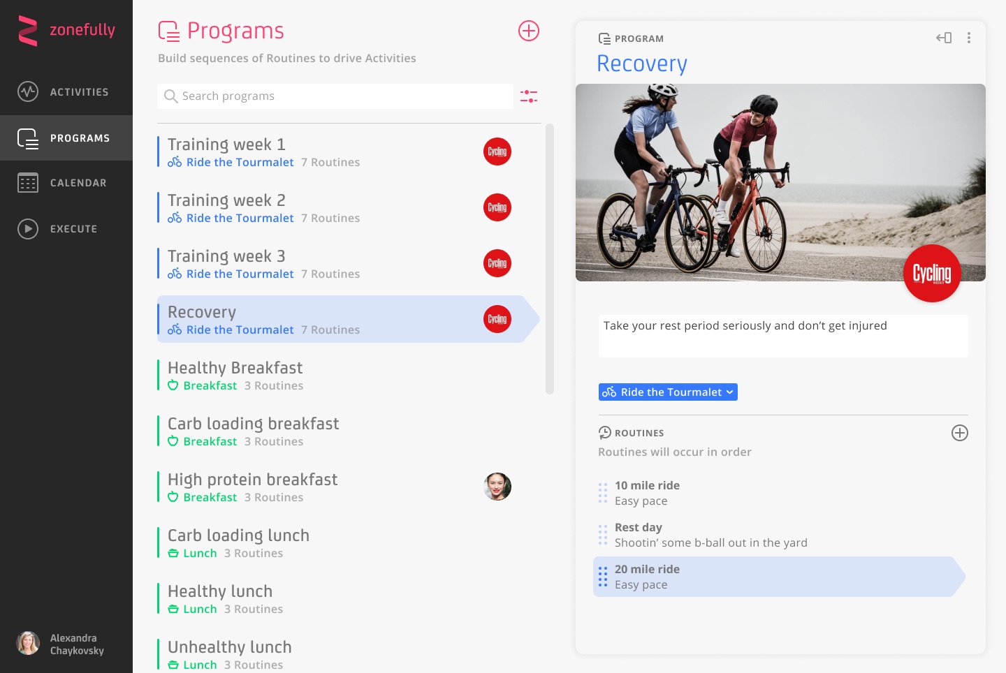
Zonefully’s founder approached me to design the UX and UI for an app that organised recurring activities around long-term goals. He had a well-developed conceptual model, and my role was to make it understandable through the interface.
During a short engagement, I designed the navigation, editing states and visual treatment, helping translate the concept into a functioning first version.
Connecting the bigger goal to the next action
Zonefully brought together several related concepts. Activities represented the things people wanted to plan and track. Programmes grouped Routines into sequences, which could then be applied to a calendar.
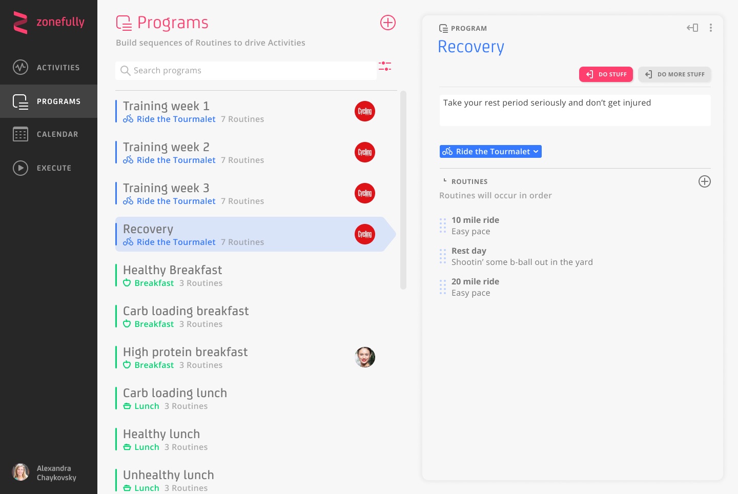
For a cycling goal, that could mean training and recovery programmes containing individual rides and rest days. The challenge was to make these relationships easy to follow without asking people to understand the whole system before they could start.
Making the structure visible
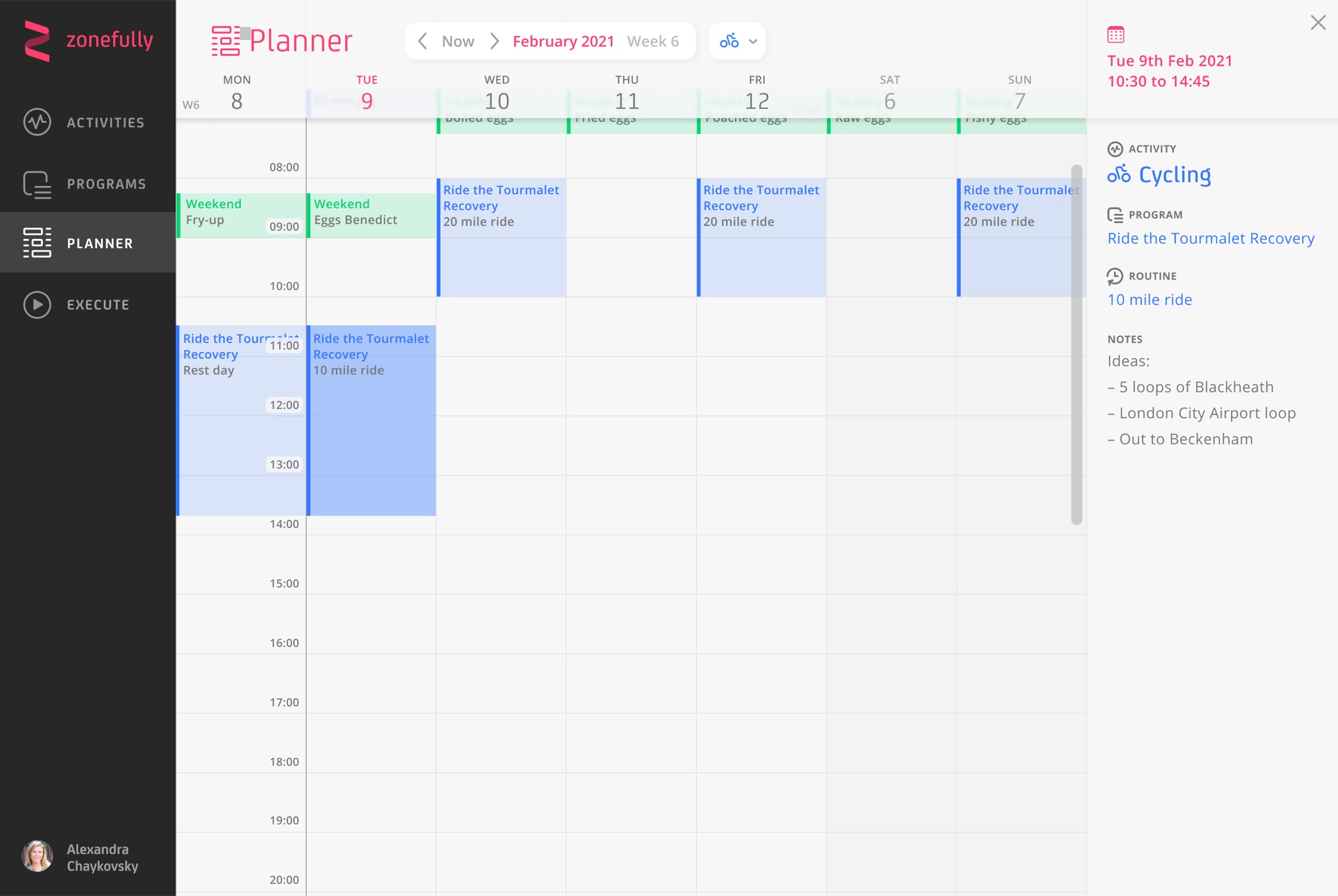
I worked within the founder’s conceptual model, focusing on how people would navigate between its different levels. Programme lists, routine lists and detail views followed a consistent visual structure.
A spacious layout separated the main areas of the interface. Activity colours, selection highlights and breadcrumb labels reinforced the connections between goals, programmes and routines.
Keeping context alongside the detail
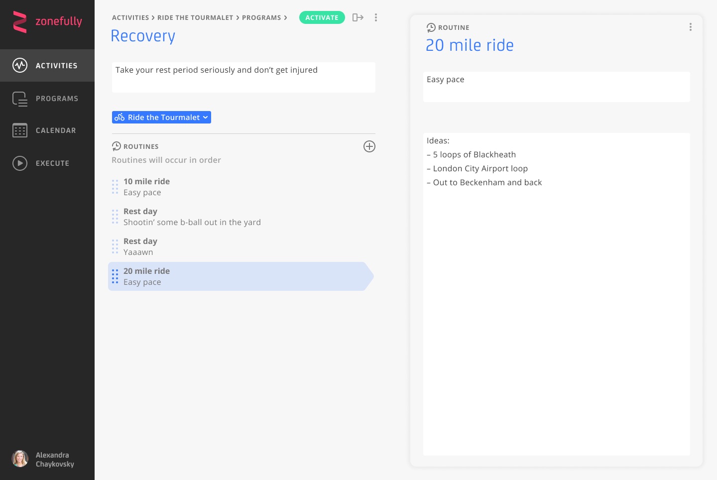
The interface centred on cards that opened and collapsed across the screen. Selecting a programme revealed its routines; opening a routine brought its details into focus alongside the programme it belonged to.
This gave navigation a consistent direction. The intention was to let people move into the detail without losing sight of the plan they were working on.
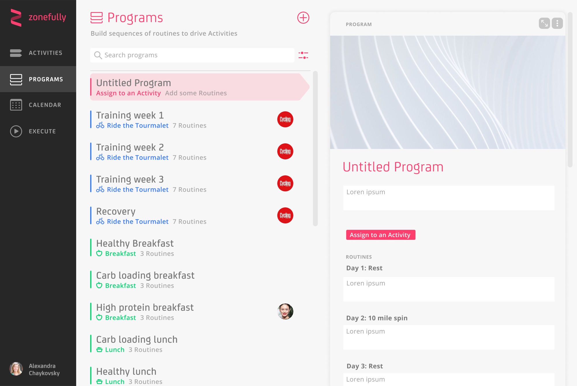
Creation states made the next steps explicit. Prompts such as “Assign to an Activity” and “Add some Routines” guided the setup of a new programme. Contextual controls grouped actions such as setting a cover image, duplicating and deleting.
Developing the interface
I developed designs for programme browsing, routine details and new-programme creation, including selection and hover states. I also explored variations in cover imagery and action placement to balance functionality with a spacious layout.
Working towards a first version
Working closely with the founder, I contributed the interaction design and visual language that helped bring the concept into a functioning v1.
A working expression of the concept
The work helped bring the founder’s concept into a functioning first version. I established a coherent visual language and a consistent way to move between goals, programmes and routines, giving the product a concrete foundation for further development.
 Pipelines
Bringing clarity to complex data flows
Enterprise data processing made accessible through flexible, visual workflows.
Zero-to-oneVisual programmingEvolution
Pipelines
Bringing clarity to complex data flows
Enterprise data processing made accessible through flexible, visual workflows.
Zero-to-oneVisual programmingEvolution