Mapping inconsistent schemas at scale
Translate inconsistent data sources to a common target format, fully automated and enhanced by AI suggestions.
Interaction designHuman-in-the-loop
- Automate a month's work in minutes
- Process 2000 files per org per month
- Continuously improved for 10 years
- Data semantics gives 4× improvement in mapping quality
In 2016, I designed a new way to map columns across inconsistent data schemas, informed by research into the labour-intensive manual processes we observed. It became one of Quantemplate's core capabilities, and remains in production nearly a decade later.
In 2026 I led its evolution from simply matching column names to weighting suggestions via the semantic fingerprinting of column data, a 4x improvement in automated mapping quality.
Hundreds of schemas, no common language
Insurance companies process risk, premium and claims data from hundreds of trading partners, each with their own data schema which needs to be aligned to the insurer's own standards before it can be used downstream. A column might be called ‘Unique Market Reference’ in one dataset and ‘UMR’ in another. Now multiply that across an average of 250 fields and 2000 distinct files a month in a typical organisation.
We observed that this was often performed manually using elaborate Excel hacks. It was slow, specialist work, the knowledge created while mapping one dataset was difficult to reuse, and the next month it all needed doing again.
Learning from the Excel workarounds
Studying dozens of Excel processes where people had manually reconciled different schemas revealed consistent patterns. The most effective approaches arranged source and target schemas vertically, using alignment across rows to show mappings. Interviews with domain experts validated the approach, but exposed a recurring pain point: constantly rearranging cells whilst keeping track of what was mapped and what remained.
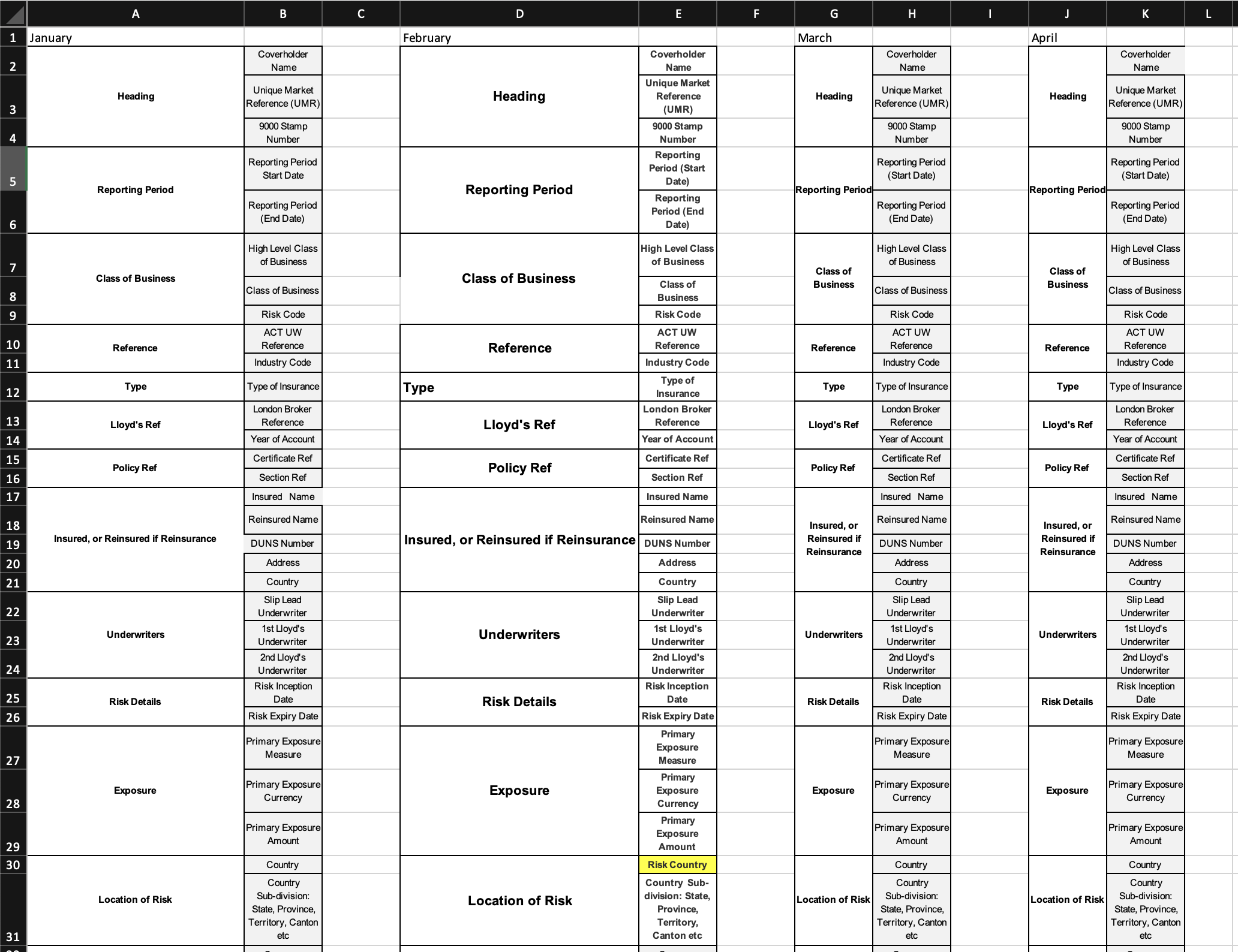
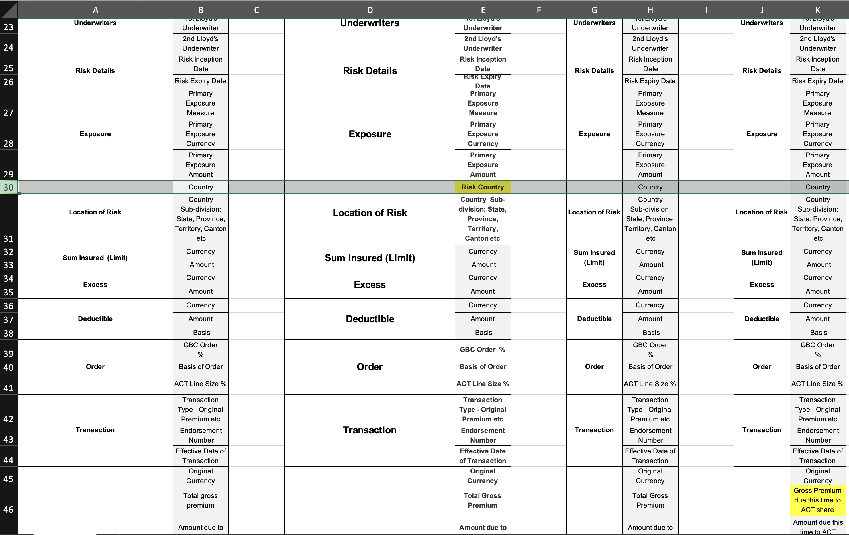
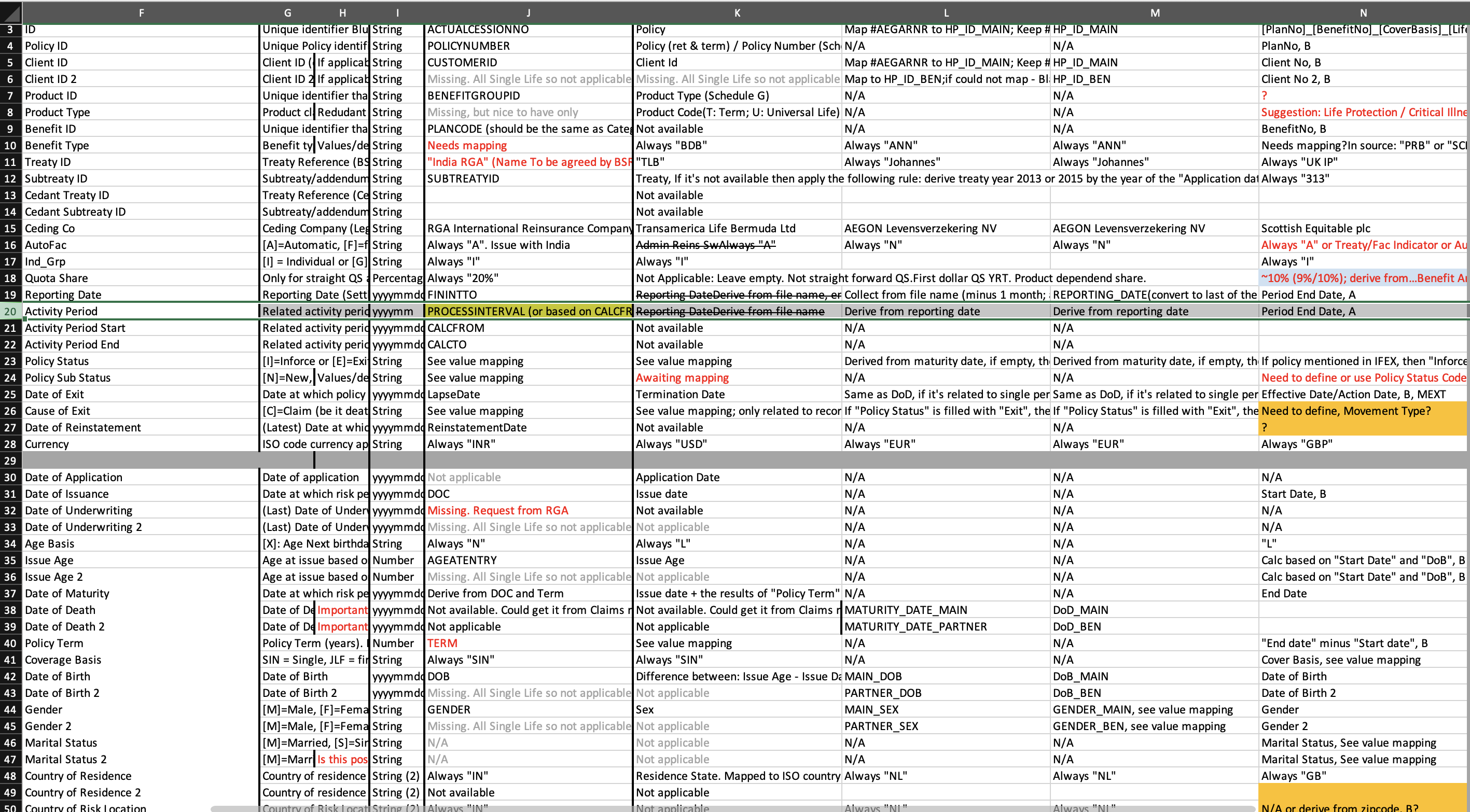
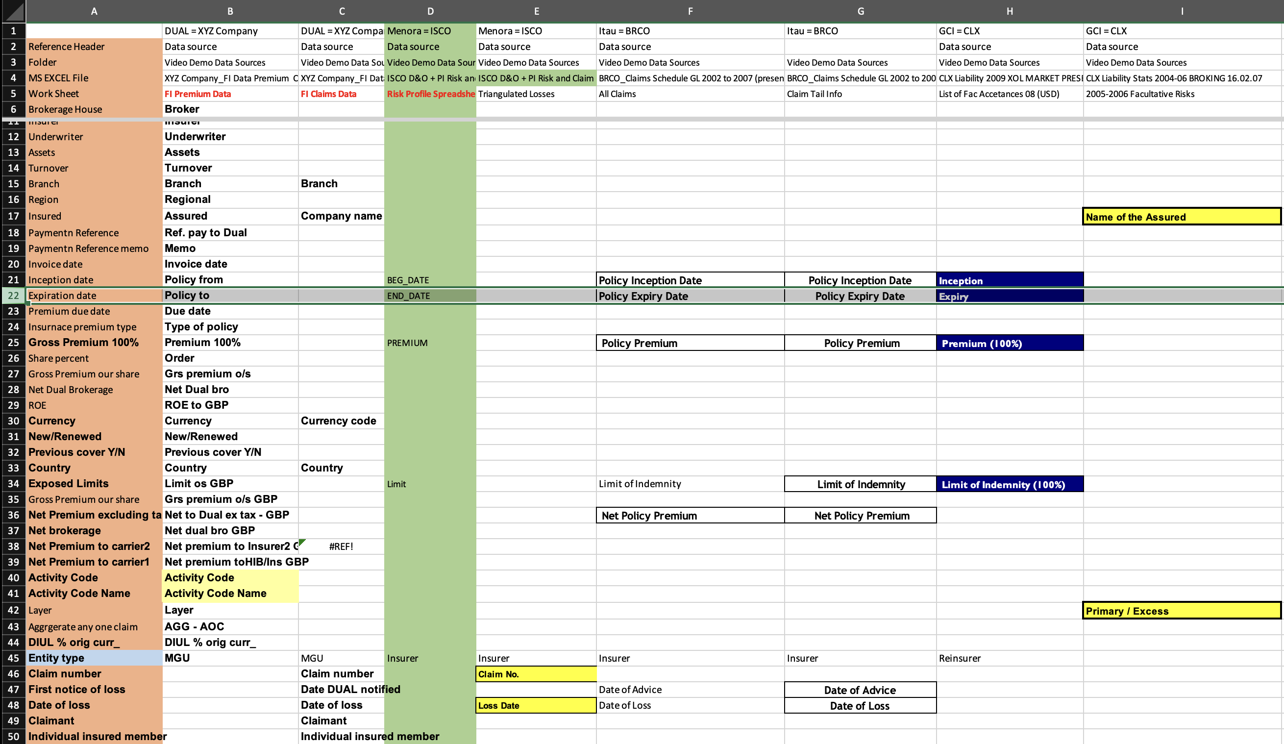
Wayfinding principle: Start with people and their journeys →
Vertically stacked fields, aligned to a common master
There was no established product pattern that we could adopt. Instead, a concept emerged directly from the research: an interface with vertically stacked fields, across which multiple schemas could align to a common master.
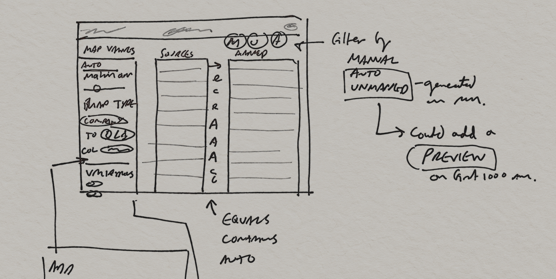
The key innovation was separating mapped and unmapped fields into mutually exclusive tabs for each schema. This made it easier to spot gaps and keep track of unmapped items, whilst a progress bar indicated the completeness of each schema.
Once source schemas were mapped in, the mappings were retained. And if a new variant came in next month, it was just a couple of clicks to get it mapped in.
Processing those 2000 files a month went from taking most of the month to a job running in the background in minutes.
Suggestions users could trust
For every unmapped field we used our matching engine to generate suggestions to map to the master schema. The next step was to automate this: allow top-ranking suggestions to be mapped at once.
I designed this as a preview mode, so users could see mapping suggestions before committing. I also added a slider, so a minimum confidence threshold could be set: incorrect mappings could be costly, so quality was more important than coverage.
These safeguards helped users trust the automation.
Following the product's desire lines
Column mapping has been in production for ten years. Over that time, we've continually adapted it to how people actually use it, following the product's emerging ‘desire lines’.
Our original sample of users were building master schemas by amalgamating multiple files. But as we broadened the user cohort, they more often started with a definitive file, such as their data warehouse target schema. We evolved the workflow to foreground that behaviour.
From column names to column contents
Whilst the interface had served our clients well, we knew the mapping algorithm itself could be improved. It just looked at the similarity of column names, and whether a pair had been mapped before. A more intelligent system would learn the contents of each column to more accurately match them to the master schema.
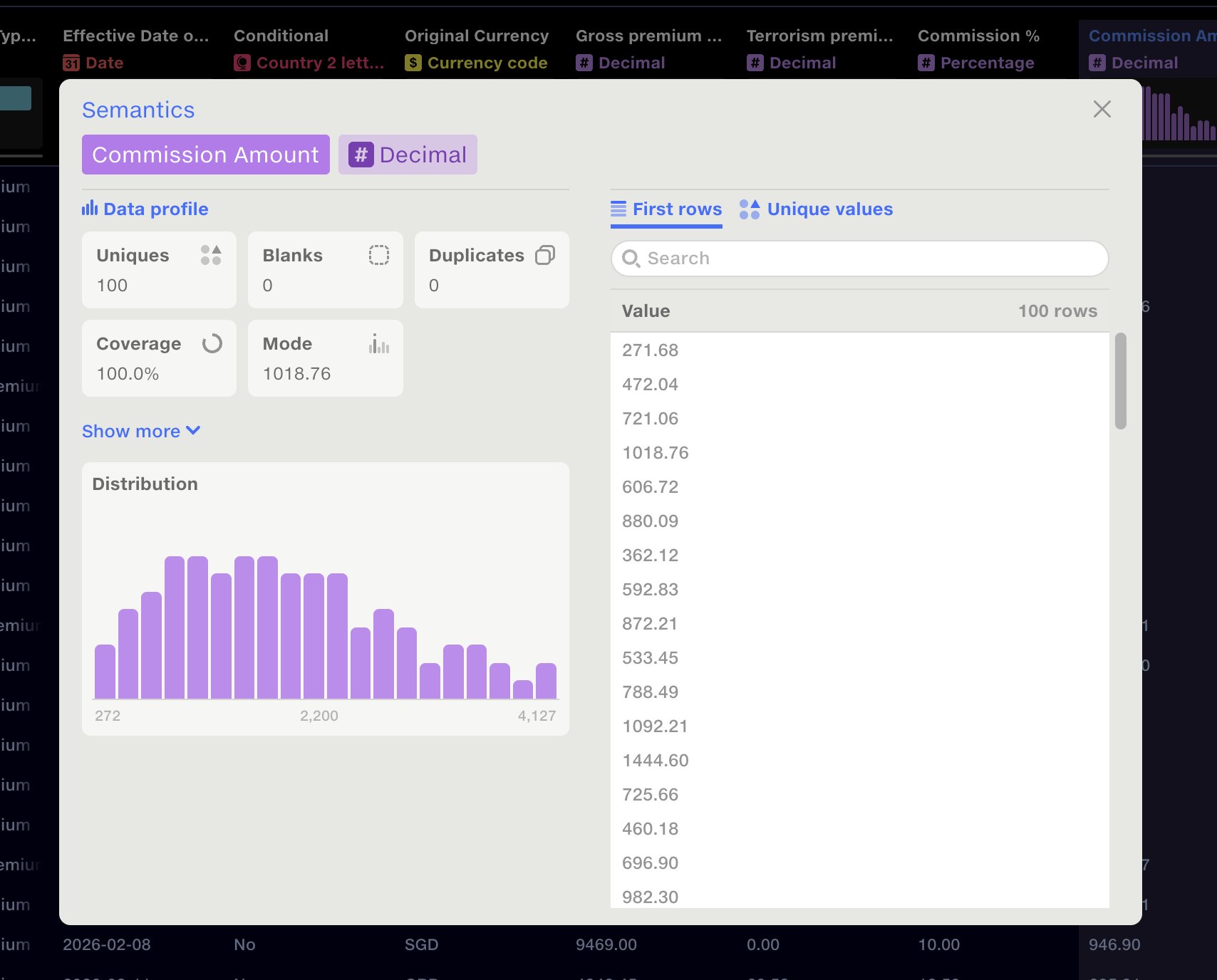
In 2026 we initiated a project to identify the type of data in each column, then profile the data inside it, creating a unique data fingerprint for each field.
Data semantics on the Quantemplate Help Centre →
I did a full audit of the current mapping behaviour, identified shortcomings in our approach and evaluated different paths for improvement. Together with a domain expert, I modelled different methodologies for weighting data fingerprints and prior usage.
When it came to the UI, we displayed the data types, allowing users to drill down and see detailed stats for each column. Prior mappings from other users now had avatars and recency information to build trust.
Our tests showed a 4x improvement in mapping quality for the same coverage.
An invisible user experience
Column mapping gives clients control over complex, high-volume data ingestion, allowing them to scale without growing operational headcount.
With the semantic upgrade, users have the confidence to run their process without even logging in: when new fields are detected, they are mapped in automatically. Our validations framework catches any rare exceptions and notifies the user.
We put considerable effort into creating a compelling user experience. On the happy path, users now never see it.
 Feeds
Connecting organisations through data
Infrastructure to automate data exchange, laying the foundation for a connected network.
Product strategySystems thinkingProcess design
Feeds
Connecting organisations through data
Infrastructure to automate data exchange, laying the foundation for a connected network.
Product strategySystems thinkingProcess design